Increase contrast
A couple of weeks ago I had a Zoom chat with Decimal Jade,1 and noticed that her screen looked really really cool. What's that?, I asked her.
It was macOS' increase contrast accessibility mode, and it's changed my life.
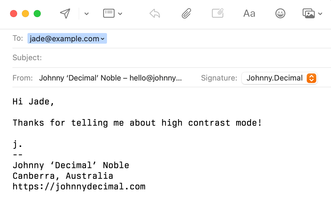
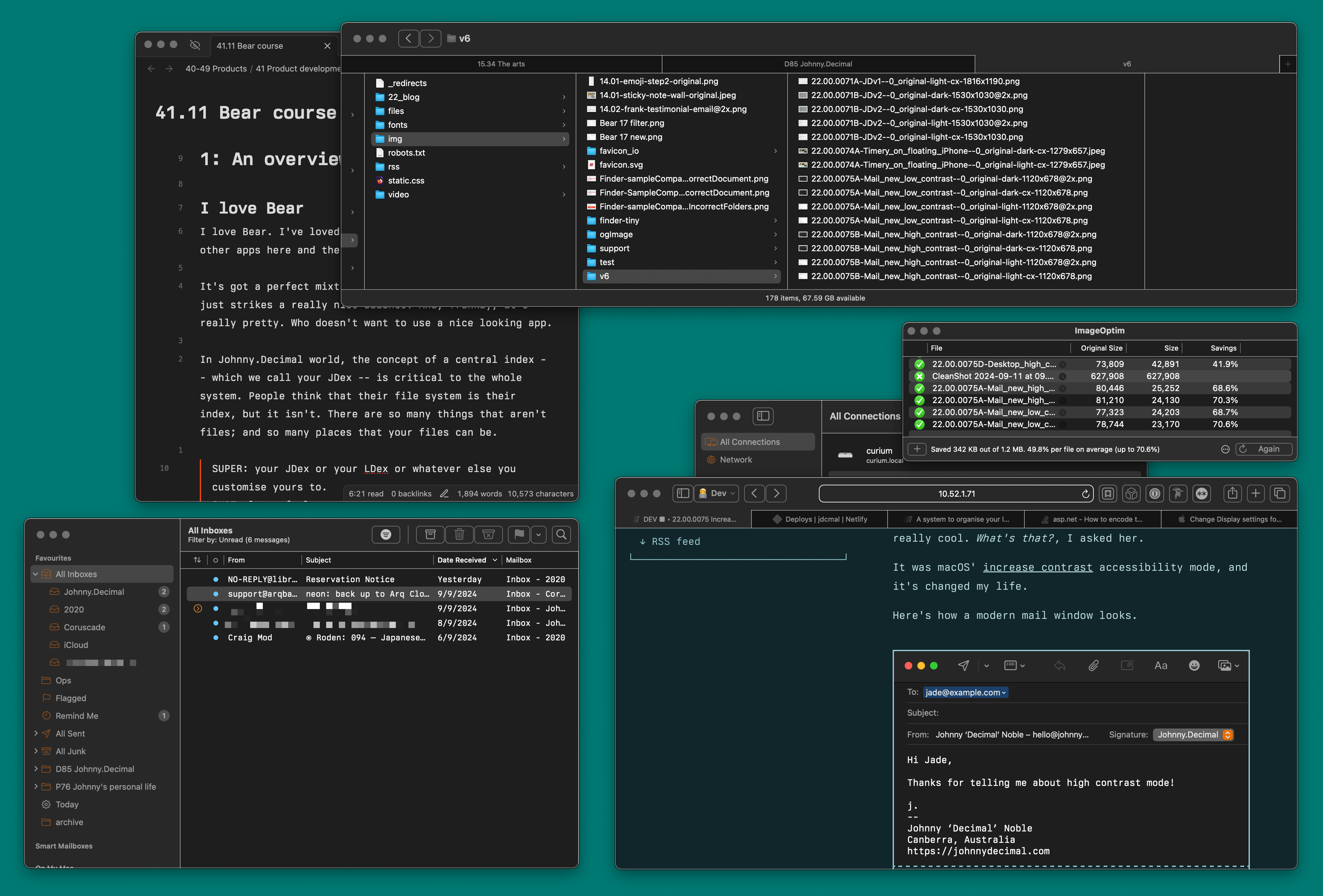
Here's how a modern mail window looks.
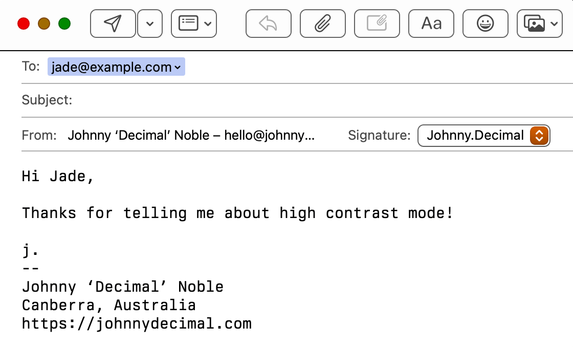
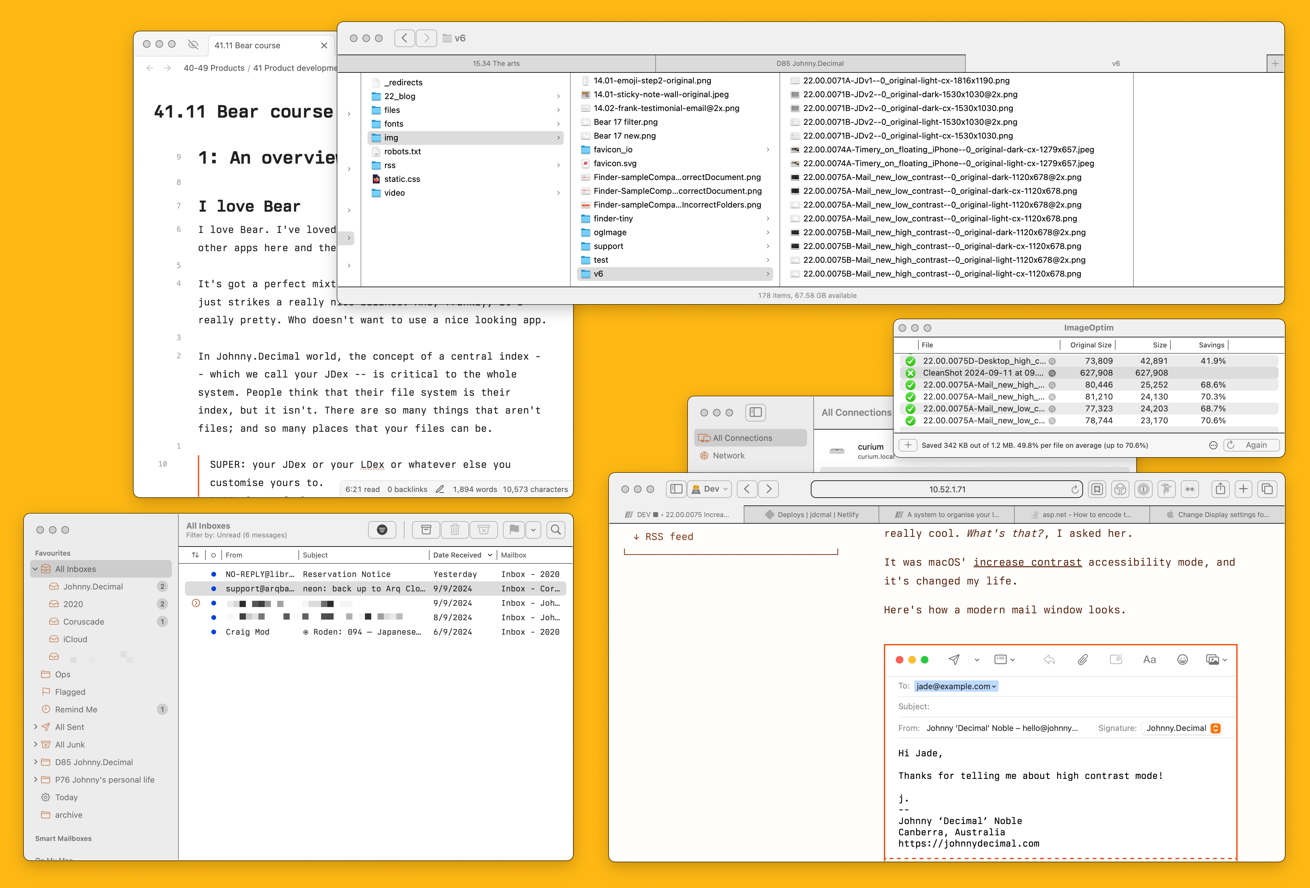
And here's how it looks with increased contrast. (And Berkeley Mono set as the display font.)
This difference is startling to my eyes and it's changing how I use my computer.
I use windows -- lowercase -- heavily, as in I have lots of overlapping windows open. As well as making each individual app easier to use, it makes my entire desktop more cohesive.
Here's the before. (Full size light, dark.)
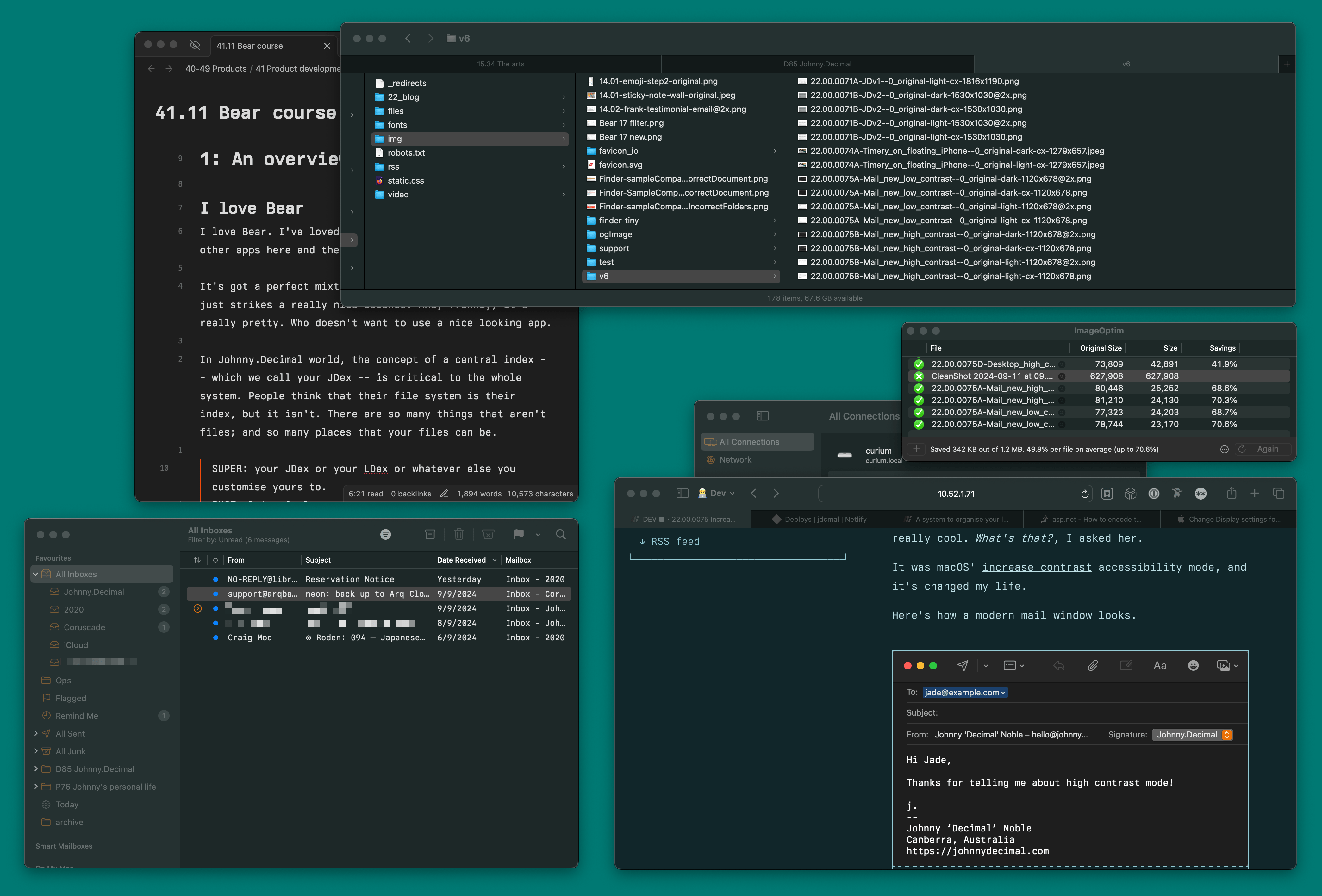
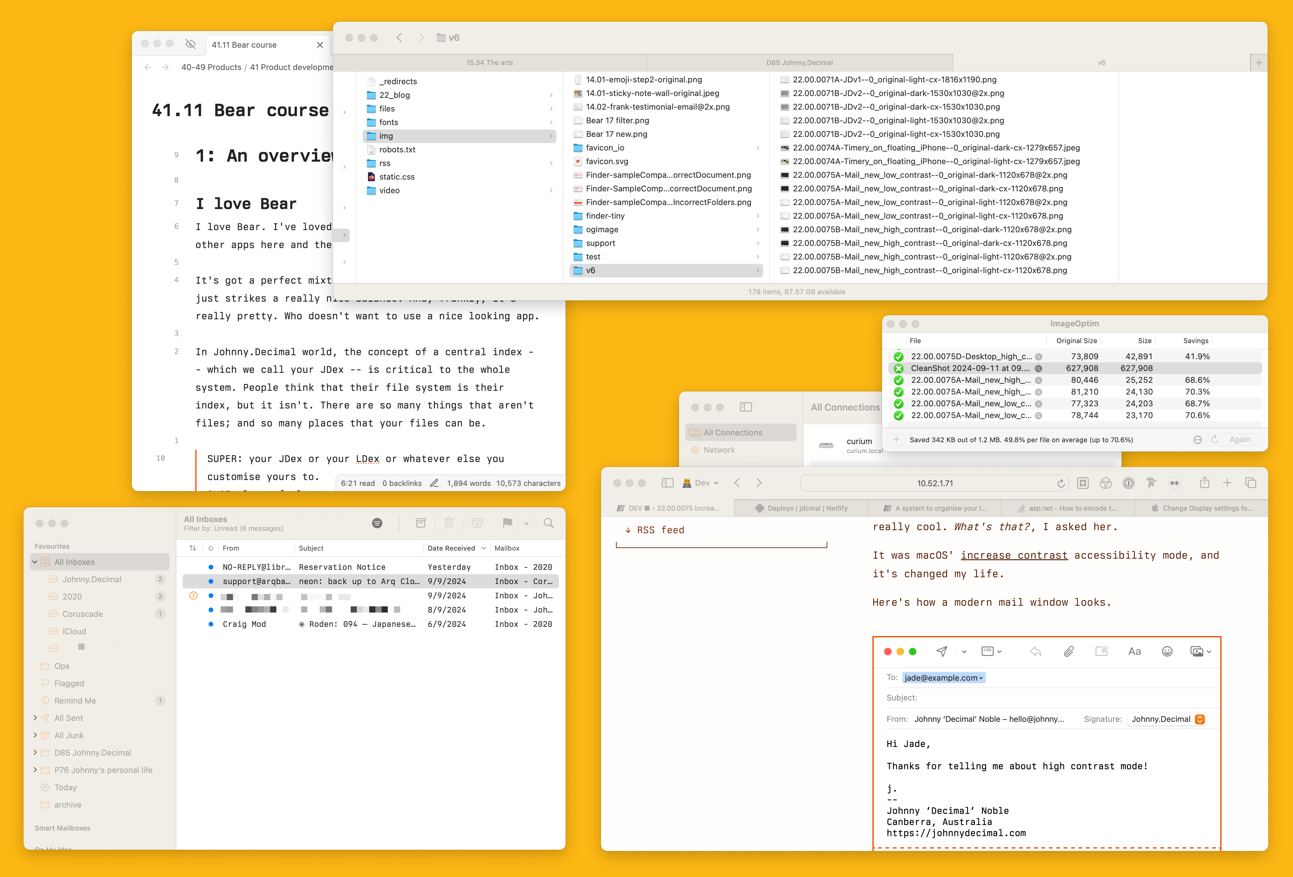
And after. (Full size light, dark.)
To my eyes we've gone from a kinda-pleasing-I-guess? smush of windows to a version where everything pops. Windows have an identity now. You might not find it as visually pleasing, but functionally it's night and day.
And, after running it for a few weeks, I do find it more aesthetically pleasing. What made us so afraid of a border around an icon? (A: Jony Ive.)
Modern apps have embraced this squishy-edge mentality, to their detriment. Here's Slack on my iPad. Honestly I look at that and I've no idea what I'm meant to do. I hate it.
There are whole threads of information hidden behind 8-point blue text. It's ridiculously un-discoverable.
Try it
Give this a go for a couple of days. It's a single toggle in your system's Settings → Accessibility → Display → Increase contrast.
I don't think I'll ever go back.
Footnotes
-
Friends-of-the-system are bestowed with the honorific 'Decimal'. ↩